Tuesday, November 23, 2010

Oscar @ International Business Park


We are engaged to design a f&b centre in IBP. The intended customers are mainly professionals working in the business park. There are many eateries in the vicinity. In order to make our f&b standout, we decided to make it feel more of a relaxed Cafe than a regular bland looking 'kopitiam'. We introduced the concept of 'Origami' to develop on the design of the foodstalls, the featurewalls, the columns and even the seats. Subtlely, it's an Arts & Coffee inspired food haven, certainly a place professionals will want to be seen patronising in.

Commercial Project in Beijing


We are engaged by a Top international decorative iron company to design their Retail shop in Beijing to showcase their latest products.

It has 2 parts. One is meant to showcase its many exquisite iron balustrades.

The other is meant for VIP only. We used a combination of 'raw materials' like polished cement screed floor and 'theatrical' lighting effects to assemble the look. We contrasted these materials with polished materials like Black tinted glass and Ice-shaped inspired Cabinetry designs. We are very sure this Retail shop will stand out amongst its many competitor neighbours.

The Chic Look


These un-altered photos are taken during a great house-warming party hosted by our clients. Many fun loving people gathered and chatted. Drinks and food are served in abundance. (Check out the Dining table and Kitchen Top). Yes, a house is meant to be lived in. It's back to the basics.

The apartment is located in an old and very charming area in the City.
Thus, instead of going for the 'Polished' look in many of our other works, we decided, with nods and collaborations with the clients, that this is one great opportunity to work on the reverse.

For this project, we want to explore and celebrate the 'raw' and 'atmospheric' feel and look instead.

We kept and gave the existing Terrazzo floor a good polish, left the rough existing walls without plastering but gave them new life through great looking colours, do away with designer lightings and dangle traditional bulbs and lamp shades throughout the Whole house, designate an entire long wall in the Living for photos to be painstakingly collected and displayed, and so many more great ideas impossible to name all here.

Sunday, November 7, 2010

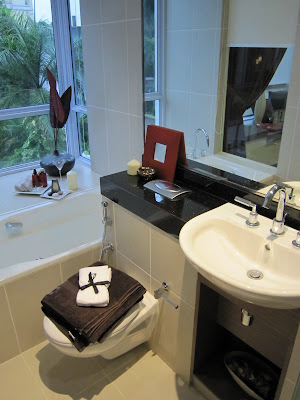
Showroom @ Newton Road - Step 3: Final Look


Showroom @ Newton Road - Step 3: Final Look


Showroom @ Newton Road - Step 2: Progress Photos

Floor, Windows and False Ceilings are in.

Time for the soft furnishings or we call Interior Styling.
Good interior styling makes the look more complete and coherent.


Showroom @ Newton Road - Step 1: Site Photos


We clinched a project to do Interior Design and Interior Styling for an upmarket Condo Showroom at Newton Road. The Client trusts us completely and does not restrict our creativity. The end result is fruit that both the Client and us are very satisfied with.